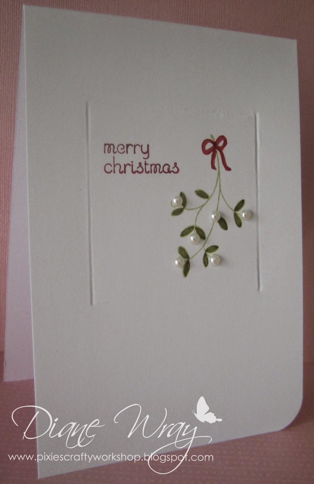
I used:
- 6" x 4" tent style white card blank
- using a square Spellbinders die, and a pricking mat underneath for some 'give', I ran a ball ended embossing tool round the inside of the die to emboss the square
- SU's 'Easy Events' stamp set, the tiny mistletoe and sentiment stamp - which I cut apart
- the mistletoe sprig was stamped using SU's 'Certainly Celery' and coloured using a green Whispers pen
- sentiment was stamped using a Tim Holtz 'Festive Berries' distress marker to colour the rubber, and using the same red marker, I drew a little bow at the top of the mistletoe sprig
- rounded off bottom corner using We Are Memory Keepers Corner Chomper and then just added pearls for the mistletoe berries
Job done!
Di
x


This is fabulous Di. Perfect composition, with just the right amount of embellishment.
ReplyDeleteThis looks so pretty Di, the pearls are a great addition!
ReplyDeleteThanks so much
Chrissie
"Less is More"
No double trouble for you apparently! You made an elegant card! Love the pearls!
ReplyDeleteHi Diane, love your card !! So clean looking and Seasonal !!
ReplyDeleteOh this is so beautiful, love it.
ReplyDeleteluv
Debby
Great way to emboss your square Di and what a super card
ReplyDeleteThanks so much for joining us at Less is More
Anne
LIM Designer
Hello Di
ReplyDeleteYour car is fabulous, I love the simplicity of the design and the added pearls are brilliant.
Thank you for the tip about embossing a square.
luv
irene
xxxx
You win my clever clogs award of the month for that brilliant idea to score round a spellbinders die...
ReplyDeleteI love this Less Is More card.
It is stunning!
What a wonderful card Di and a brilliant idea to emboss a frame xx
ReplyDeleteLovely card Di. Brilliant idea (one I shall be pinching ;-) Dee xx
ReplyDeleteI just love this card Di, it's stunning. Hugs, Elizabeth xx
ReplyDeleteWhat a beautiful card it's really elegant
ReplyDeleteJackie x
Perfect! Understated and very elegant - less really is more!
ReplyDeleteOh . . . good chomping there Di!
ReplyDeleteLove this uber-CAS foliage card for the challenge. BRILL.
Hugs, Sarn xxx
Awww Di what a pretty card just love how simply but gorgeous it looks truly beautiful x
ReplyDeleteSo beautiful Di, love the pearls on it. Hugs, Veerle xxx
ReplyDeleteA lovely card - the pearls are a great idea.
ReplyDeleteKath x
Very stylish :-) xx
ReplyDeleteSo simple yet so pretty. Well done! Kate x
ReplyDeleteAhhhh so divine Di,
ReplyDeleteLove this card ... I'm definitely going to have to put my Christmas head on with all these very organised folk entering Chrimbo cards this week. Loving the pearly mistletoe too.
Super CAS and elegant.
Thanks so much for sharing and taking part.
Sarah xx
Less is More
A clever one layer card
ReplyDeleteBeautiful Di! x
ReplyDeleteDi, this is so beautiful! :)
ReplyDeleteHugs,
Em x
Creative Em
Perfectly CAS :) Hugs Bev x
ReplyDeleteAnother cracker Di, love it.
ReplyDeleteKath x
A stunning CAS card, I love it. Great use of pearls too.
ReplyDeleteJean x
This is Bootiful Miss Di, just Bootiful.
ReplyDeleteSo simple and clean. Love it!
xx
This is so simple and beautiful Di I love it!
ReplyDeleteLucy x
Perfect CAS, love it :D xx
ReplyDeleteSo elegant and beautiful (don't forget you can enter any Christmas cards for CHNC extra) xx
ReplyDeleteLove the simplicity of this one!
ReplyDeleteHugs
Debs x
Clean, simple, elegant, and just beautiful. Those pearls really added something special. Liked the debossing very much. Great design idea. TFS
ReplyDeleteOne of my all-time favorites, Di! Pinning this beauty!
ReplyDelete